Subscribers
Dive deep into Recurly's subscribers analytics for a comprehensive view of subscriber behaviors, trends, and growth patterns.
Overview
Required plan
This feature or setting is available to all customers on any Recurly subscription plan.
Prerequisites
- Users must have analytics user role permission.
Definition
The Subscribers dashboard of Recurly's Reporting & Analytics offers a comprehensive set of reports and metrics to help you track and analyze subscriber counts and trends.
Key benefits
-
Measure growth: Understand how your acquisition rates are trending over time.
-
Subscriber composition: Gain insights into what your target group of subscribers your targeting efforts are attracting between new or returning.
-
Forecasting and planning: Enable more accurate forecasting and long-term planning to help businesses set reachable growth targets and allocate resources effectively.
Definition
The "Subscribers" section within Recurly's Reporting & Analytics suite offers a wide array of reports and metrics tailored to help you keep a close eye on and analyze the number of your subscribers as well as their trends. This tool is instrumental in gaining insights into the dynamics of your subscription signups, churn rates, and the overall growth of your subscriber base.
Key details
Note: It's important to understand the difference between a subscriber and a subscription. A single subscriber may have several active subscriptions, but this dashboard's focus is on counting each subscriber as one entity, rather than tallying the total subscriptions they may hold.
For more information on how to navigate and make the most of the filter tools available, please refer to our documentationhere.
Filters (top left corner)
- Date range: Utilize dropdown menus to select a specific timeframe and date range for the data displayed on the dashboard.
- Timeframe: Adjust this to view data over different periods for a more detailed or broader overview.
- Subscriber type: This filter lets you categorize the data by the type of subscriber, whether they are paying, non-paying, or in a trial phase.
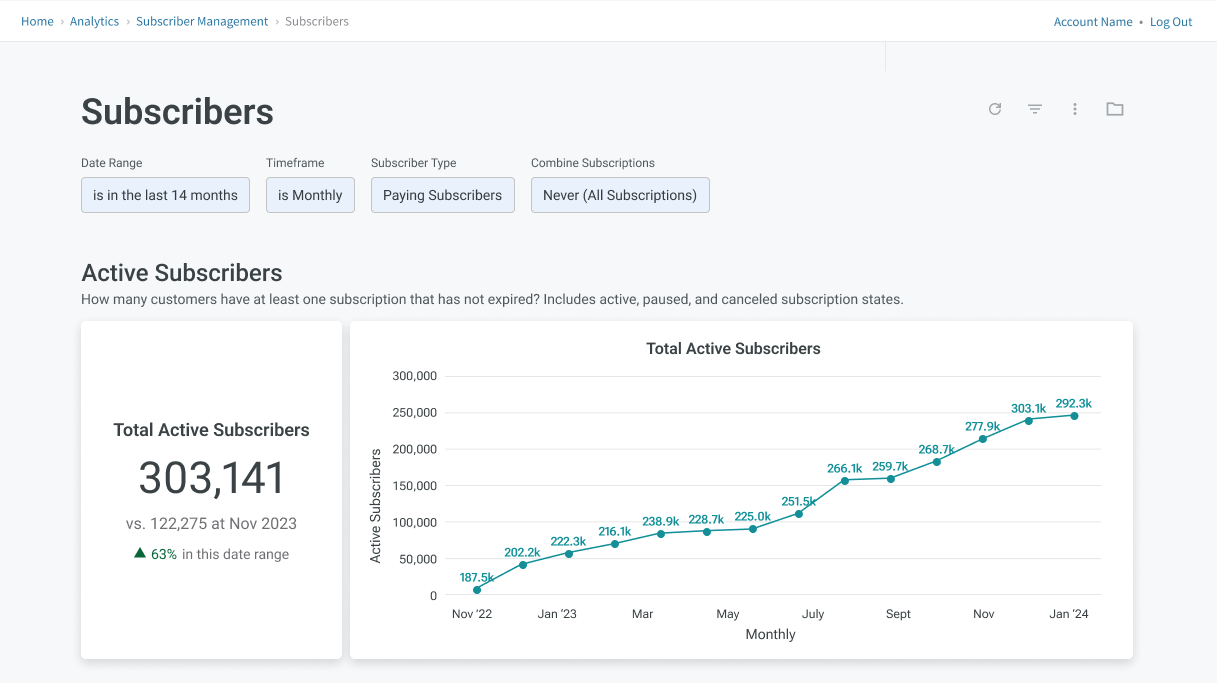
Active subscribers
This dashboard segment is designed to clarify the total number of customers who maintain at least one active (not expired) subscription, including those in active, paused, or canceled states.
The KPI widget immediately shows the total number of active subscribers and highlights how this number has changed compared to the same date in the previous year.
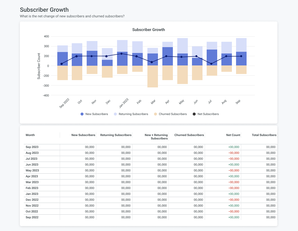
Subscriber growth
This section is designed to give you a clear perspective on the trends influencing the growth of your subscriber base. Through an easily interpretable chart, you'll be able to track the numbers of both new and returning subscribers, alongside the count of those who have churned. This visualization aids in determining your net subscriber count, essentially answering the pivotal question: What is the net change in the number of new subscribers compared to those who have churned?
- New Subscribers: Individuals signing up for a subscription for the first time.
- Returning Subscribers: Former subscribers who have reactivated their subscription.
- Churned Subscribers: Subscribers whose subscriptions have ended, either voluntarily or involuntarily.
Accompanying this chart, a detailed table breaks down these figures on a monthly basis. This breakdown allows for a deeper dive into the specific changes month over month, offering insights into the ebb and flow of your subscriber dynamics. This data is crucial for understanding the overall health and growth trajectory of your subscriber base.
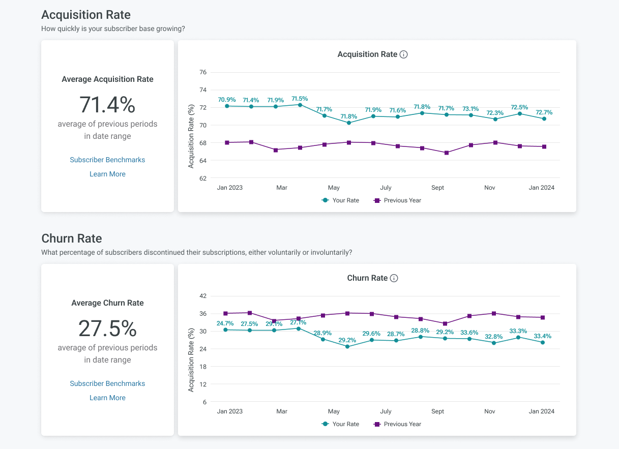
Acquisition and churn rates
View the acquisition rate and churn rates in a YOY comparison to learn how your subscriber base is growing, and what percentage of your subscribers discontinued their subscription either voluntarily or involuntarily. Compare these rates to the benchmarked version to understand how you compare to those in your industry.
FAQs
Where did the previous Subscribers dashboard go?
If you're looking for the previous version of the Subscribers dashboard, it hasn't disappeared. A link to the “Subscribers (Legacy)” dashboard is provided at the bottom of the subscribers page. Please note, Recurly plans to phase out the legacy dashboard, so it's a good idea to familiarize yourself with the current dashboard's features and capabilities.
How is churn and acquisition calculated?
Throughout our dashboards, churn and acquisition are calculated by comparing subscribers who are not expired at the beginning of the time period vs the subscribers who are not expired at the end of the time period. For example, if using a weekly timeframe, if a subscriber is not expired at the beginning of the week but is expired at the end of the week would be churn.
Updated 3 months ago