Subscription by plan
Discover the power of 'Subscription By Plans Bars': A vibrant and detailed breakdown of plan subscription trends over time.
Overview
Required plan
This feature or setting is available to all customers on any Recurly subscription plan.
Prerequisites
- Users must have Analytics user role permission.
Definition
Recurly's 'Subscription By Plans' offers a rich, color-coded visualization of your subscriptions categorized by different plans. Displayed over your chosen timeframe, this feature enables users to effortlessly discern the popularity and performance of each plan.
Note: It's essential to note the distinction between a subscriber and a subscription. While a single subscriber might hold multiple active subscriptions, this dashboard focuses on counting the individual subscriber, not the number of subscriptions they possess.
Note: Data only includes plans that have had at least 1 subscriber.
For additional guidance on navigating and utilizing filter tools, consult our documentationhere.
Key benefits
- Instant plan popularity overview: The color-coded bars provide an immediate insight into the traction of each plan, helping users identify dominant trends at a glance.
- Interactive deep dives: With each bar being drillable, users can seamlessly access detailed subscription metrics, facilitating in-depth analysis without leaving the visualization.
- Strategic trend analysis: The detailed chart highlights the performance trajectories of your plans, assisting in proactive decision-making, plan refinement, and the crafting of targeted subscription strategies.
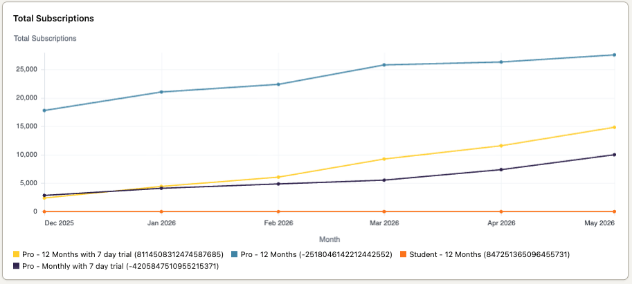
Total Subscriptions
Total Subscription is a visual representation of your subscriptions, segmented by different plans over a selected timeframe. Each line corresponds to a specific plan, and the height of the bar represents the total number of subscriptions. The line is further color-coded based on different plans, giving you an instant visual clue about which plans are gaining more subscriptions.
Subscription Breakout
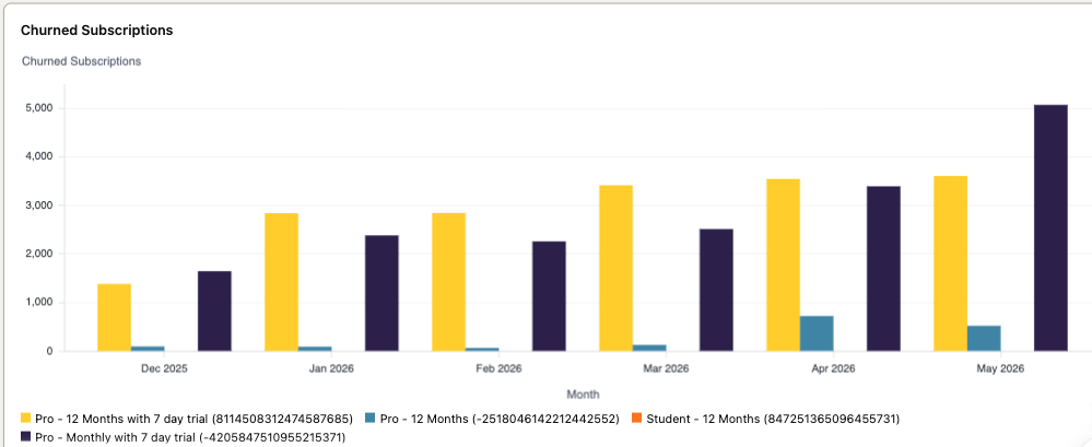
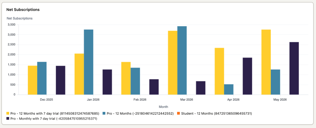
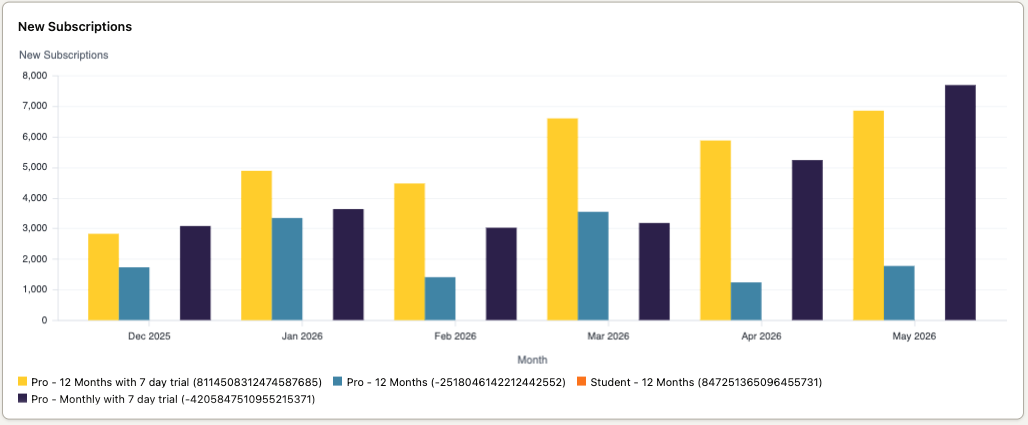
The three bar charts include net subscriptions, new subscriptions, and churn subscriptions. These charts can be used to analyze the subscription growth rate, identify which plans are gaining or losing subscribers, and determine if certain plans have higher churn rates.
Plan Performance Net Subscriptions
Plan Performance New Subscriptions
Plan Performance Churned Subscriptions