Inline prompts
Comprehensive guide to creating and managing inline prompts—horizontal, vertical, tile, and text-only—using defined zones in Recurly Engage.
Overview
Video
Required plan
This feature or setting is available to all customers on any Recurly Engage subscription plan.
Prerequisites & limitations
- You must have Company, App Administrator or App member permissions in Recurly Engage.
Definition
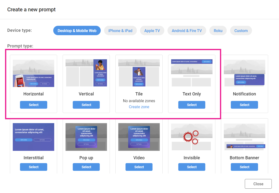
Inline prompts occupy predefined zones on your site or application. Four styles are supported—horizontal banners, vertical panels, tiles, and text-only bars—each designed to blend with your layout.
Key benefits
- Contextual placement: Deliver messages directly within your page for higher relevance.
- Versatile formats: Choose from four inline styles to suit any design.
- Dynamic sequencing: Render multiple items per zone in stack, list, or slider modes.
Key details
These four prompt types occupy defined zones on your site or application alongside your content—hence the name inline.
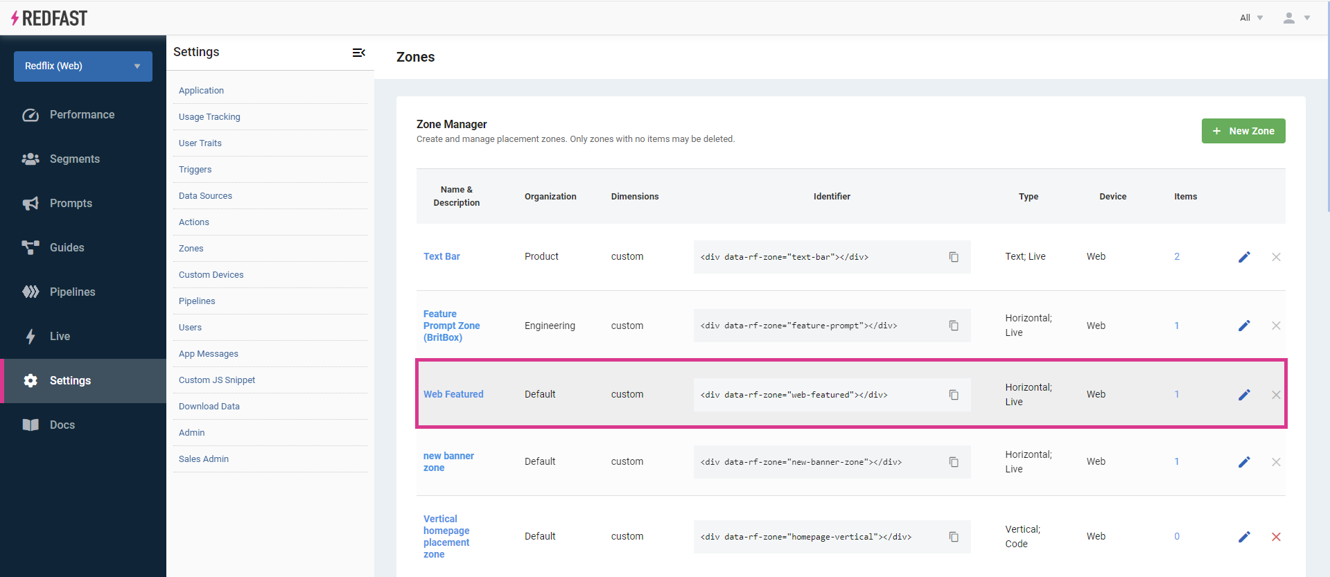
Inline prompts live in zones. Any prompt assigned to a zone appears in that location—for example, a horizontal banner in the Web Featured zone.
A single zone can render multiple items of the same type in one of three modes:
- Stack: items overlap; each new item appears after the prior one is dismissed.
- List: items display side by side, ideal for showing a row of personalized recommendations.
- Slider: a carousel showing one item at a time, with optional bullet indicators or auto-rotation.
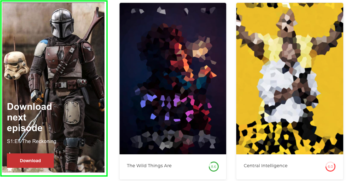
Horizontal
A wide banner with a landscape orientation that spans the width of your content area or screen edge-to-edge. Commonly placed at the top or bottom of pages, it can include a call-to-action button and hide itself on click or remain visible.
- Recommended ratios: 2×1, 4×1, 6×1, 8×1, 10×1.

Vertical
A tall panel with a portrait orientation, typically along the left or right edge of your layout. Like horizontals, it may include buttons and can be timed or click-to-dismiss.
- Recommended ratios: 1×2, 1×3, 1×4.

Tile
A square or rectangle zone—perfect for grid layouts. Tiles display media and text, and can be closed or persist after interaction.
- Recommended ratios: 1×1, 4×3, 16×9.
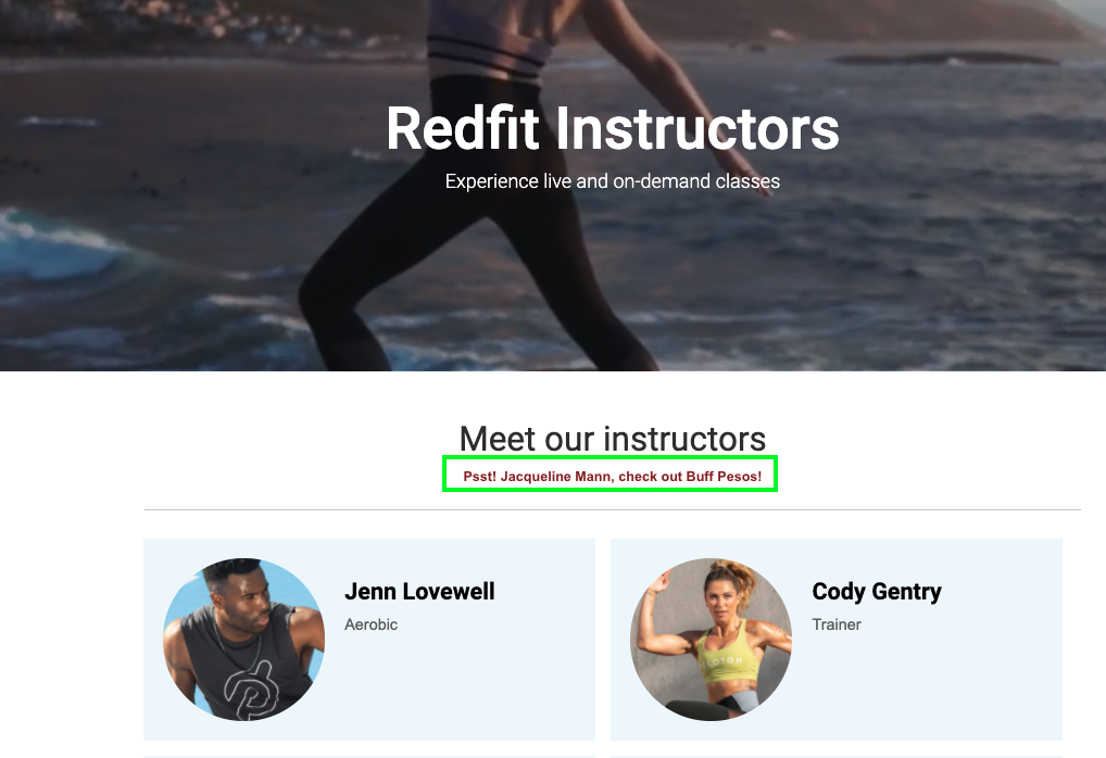
Text-only
A clickable text bar without images, useful for simple announcements or links. It can be configured to hide on click or remain in view.
- Recommended ratios: 6×1, 8×1, 10×1.
Step-by-step guide
-
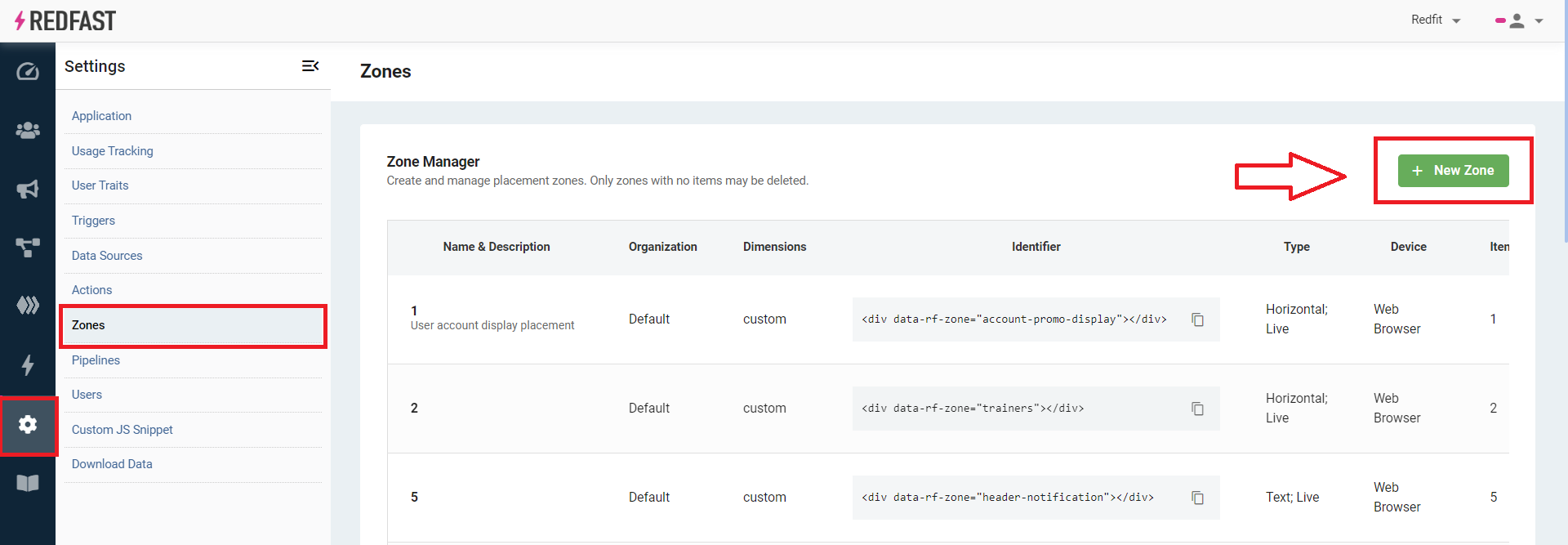
Create a zone
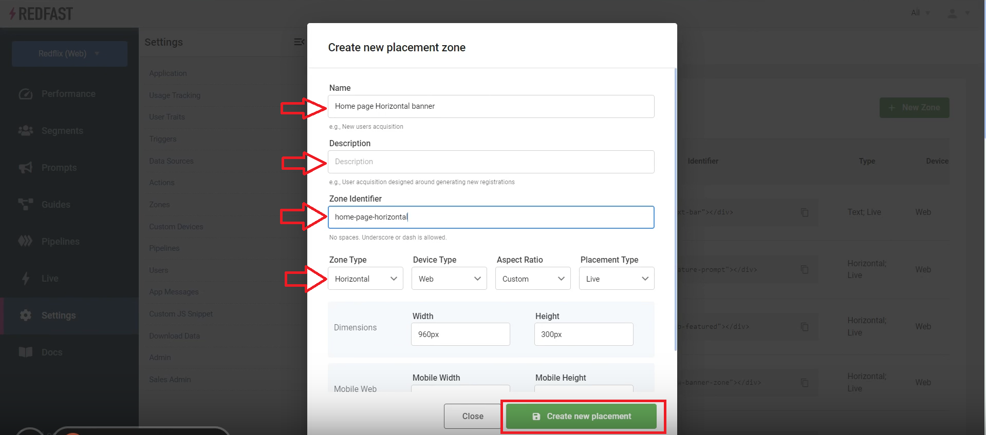
- Navigate to Settings→Zones→New Zone.
- Name the zone (no spaces) and select its placement (e.g., “Home Page Top Banner”).
-
Build an inline prompt
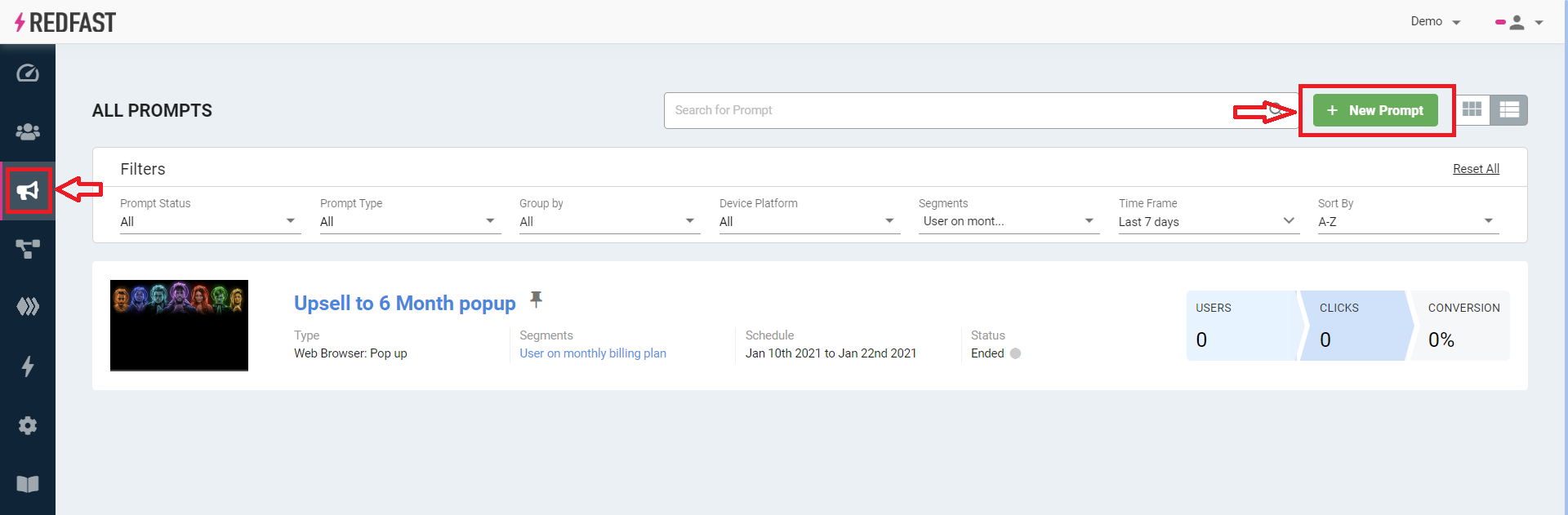
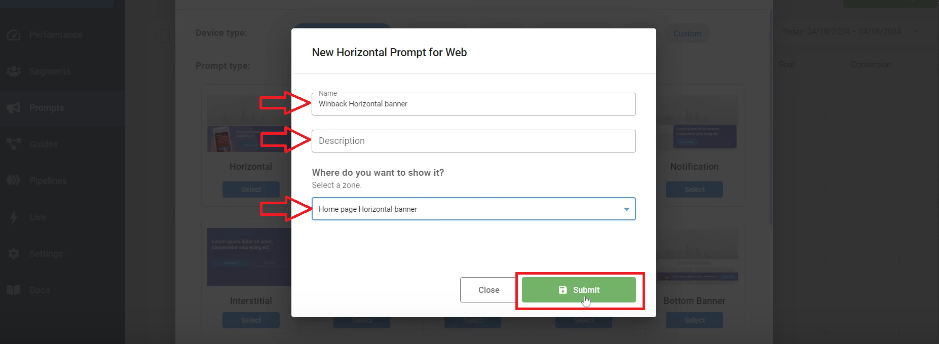
- Go to Prompts→New Prompt.
- Choose Desktop and Mobile, then select Horizontal (or your desired inline type).
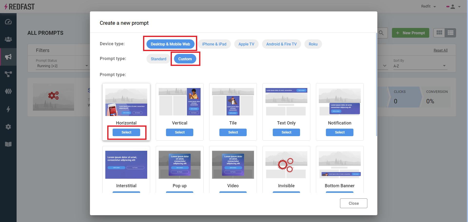
- Enter a Name, Description, and assign it to your new zone, then click Submit.
-
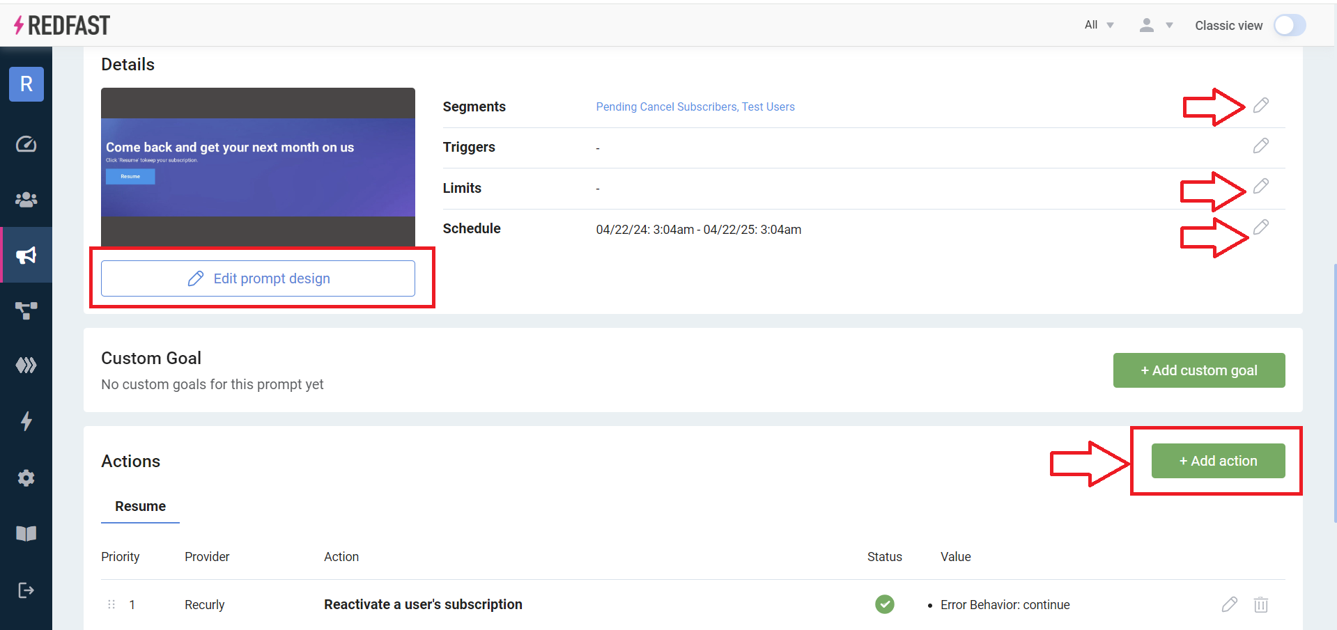
Configure Segments, Limits (optional), Schedule (optional), and Actions.
-
Click Edit prompt design to customize visuals and copy.
- Tweak settings in the designer and preview live changes. Download sample backgrounds here.
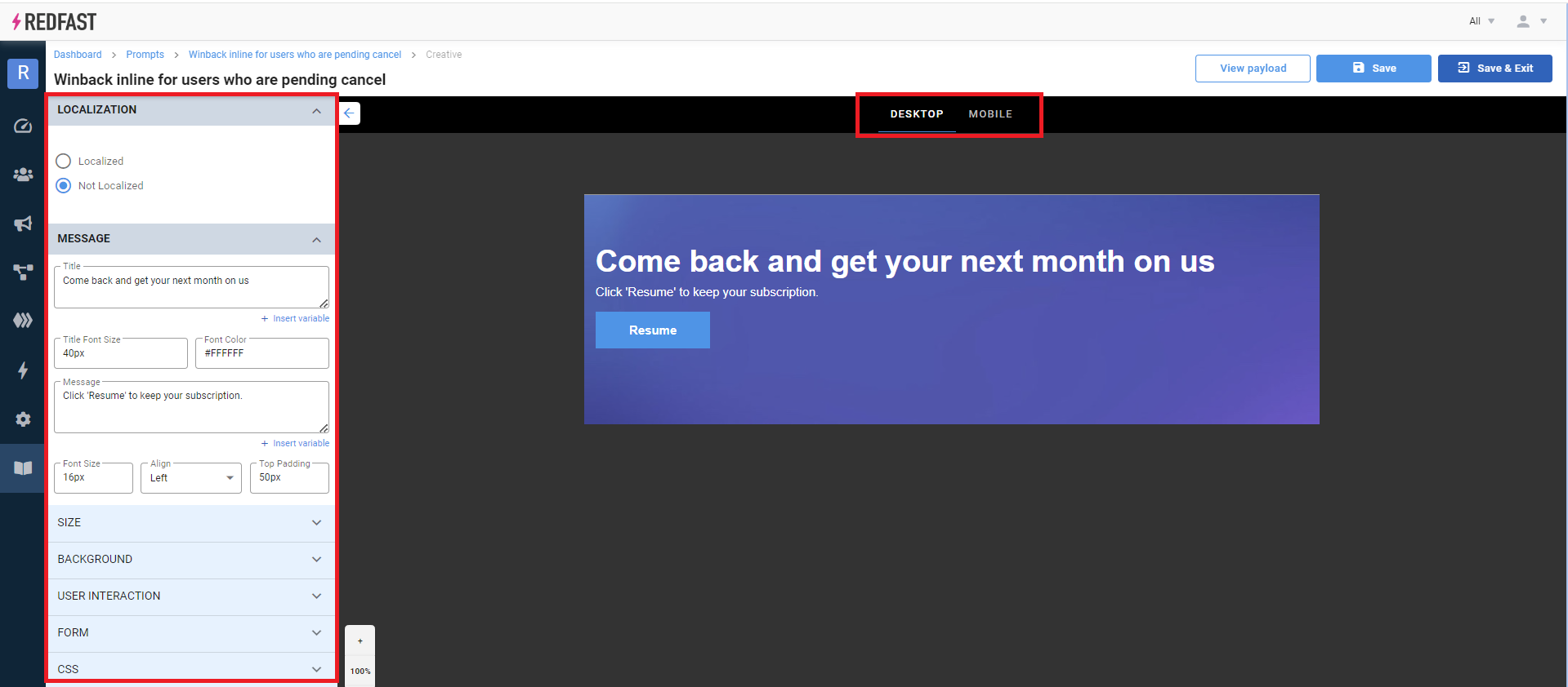
- Click Publish to make the prompt live.

-
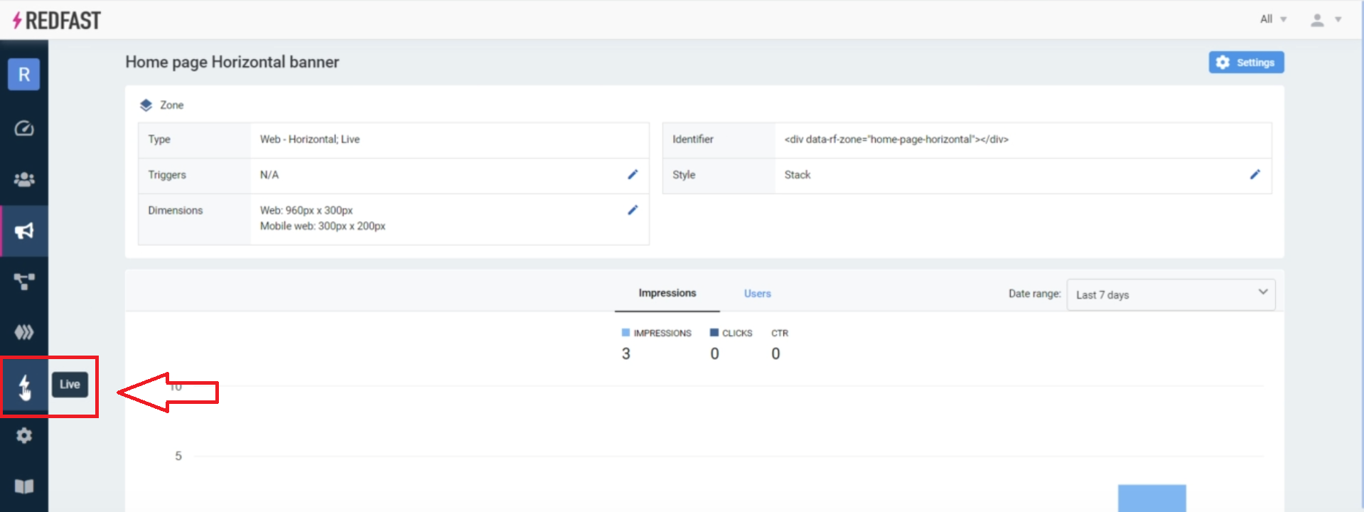
Manage your zone
- Under Settings→Zones, view all prompts assigned to a zone.
- Switch between Stack, List, or Slider display modes for multiple items.

Integration
Live tool
- Click the Live Tool button and select your domain.
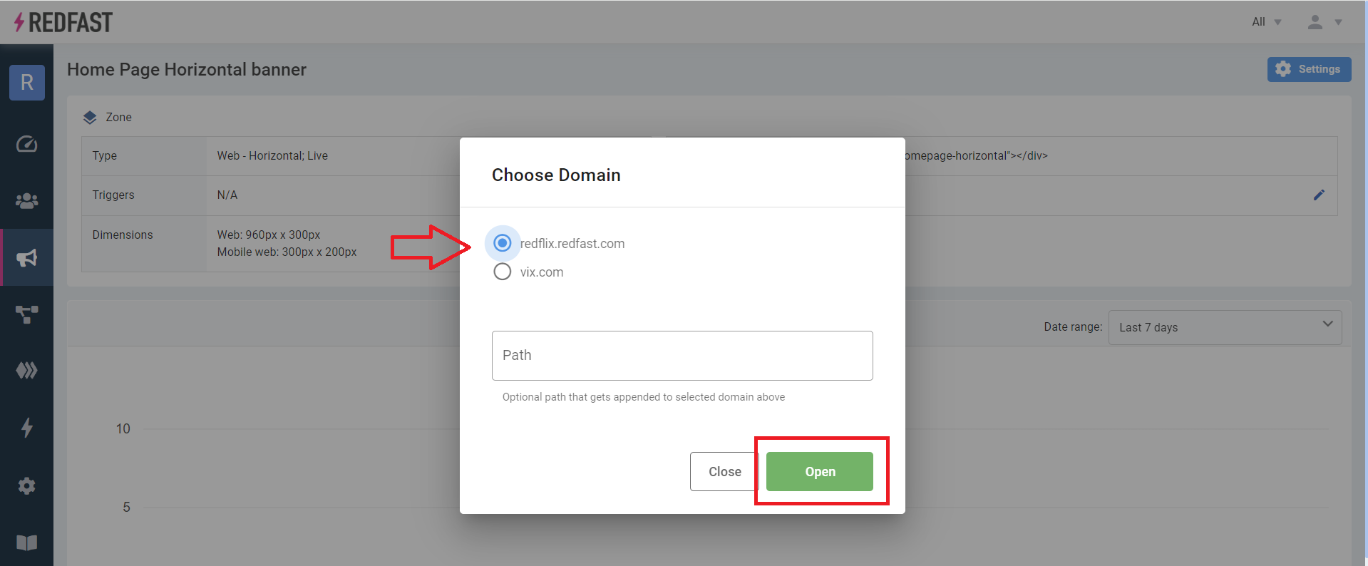
- Expand the panel, switch to the Add tab, and choose your zone.
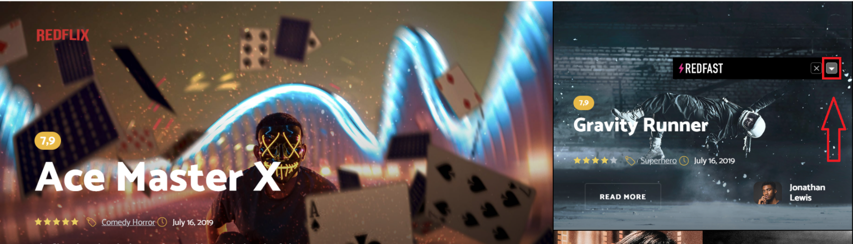
- Hover over the target area until the outline appears, then click to insert the zone.

Developer guide
- Copy the zone identifier (e.g.,
data-rf-zone="example-tag"). - Insert into your HTML:
<div data-rf-zone="example-tag"></div>- Optionally wrap in a container with explicit height for absolute positioning:
<div style="height:200px">
  <div data-rf-zone="example-tag"></div>
</div>
Tips and tricks
Absolute positioning - new content
- Insert the zone tag where needed.
- Wrap in a container with a set height.
- Initialize your scroll or animation logic.
Absolute positioning—replacing content
Use the Live Tool sparingly—ensure your prompt dimensions match the existing element.
Content delay solutions
- Header load lag: add CSS animations or skeleton loaders.
- Above-the-fold delay: set explicit height with a brief no-collapse timer.
- Slow SDK load: move the Recurly Engage tag earlier in your tag order.
Responsive resizing
- Use CSS media queries or
transform: scale()for width issues. - Apply
background-size: coveror bake text into images for backgrounds.
Updated 7 days ago