Dashboard
The Recurly Analytics Dashboard provides real-time insights into subscriber metrics, subscription performance, and revenue — organized across Customers, Subscriptions, and Revenue sections.
Key details
Widget interactions
Every widget on the dashboard shares the same set of interaction tools.
Vertical ellipsis menu — Available on both widgets and tables. Click to access:
- Ask a follow-up question — Type a question to drill into subsets, re-aggregate data, or get an AI-generated summary without opening a new report.
- Download — Export the tile's query results as CSV, PDF, or PNG.
- Data timestamp — See when the data in that widget was last updated.
Charts and legends — Widgets use bar, line, and pie charts to display customer, subscriber, subscription, plan, and revenue metrics over time.
- Hover over a chart element (a point, bar, or segment) to see the value and timeframe for that item.
- Click a color in the legend to toggle that data series on or off. Click again to restore it.
Customers
The Customers section provides a view of subscriber metrics across five widgets.
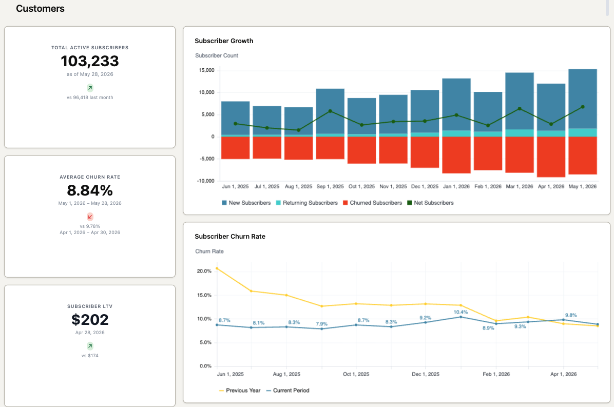
Total active subscribers
The count of unique subscriptions with at least one active subscriber — including subscribers in a trial and those who have canceled but not yet churned.
Average churn rate
The percentage of subscribers who churned in the last month, calculated against the number of active subscribers at the start of that month.
Subscriber Lifetime Value (LTV)
An estimate of the lifetime value of each subscriber based on discounted cash flows, accounting for future revenue risks and the time value of money.
Formula: Subscriber LTV = ARPS × (1 + d) / (d + Churn Rate)
- ARPS (Average Revenue Per Subscriber) = MRR at end of month ÷ number of active subscribers at end of month
- Churn rate = as calculated above
- d (discount rate) = 1% — a generally accepted constant for SaaS companies that reflects market and financial risk and the time value of money
Example: Company X has MRR of $555,000, 5,000 subscribers, and a 3.5% churn rate at end of August.
Subscriber LTV = ($555,000 / 5,000) × (1 + 0.01) / (0.01 + 0.035) ≈ $904
Subscriber growth
Net subscriber change over time, calculated as: new subscribers + returning subscribers + churned subscribers. Click any point on the line to see net totals for that timeframe in hover text. Click any bar segment to see totals for the selected period.
Subscriber churn rate (detailed)
Churn rate over a selected date range. Churn rate is not calculated for periods shorter than one full month. Click any point on the line to see the churn rate for that timeframe.
Subscriptions
The Subscriptions section provides insights into your top subscription plans through three widgets.
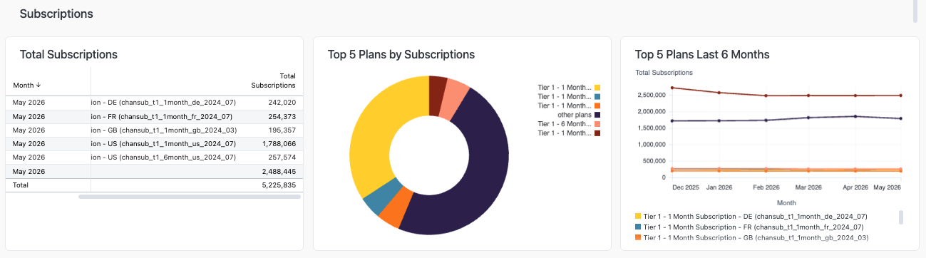
Total subscriptions
The total number of subscriptions across your top five plans as of the most recent data update. Toggle the arrow in the first column to sort ascending or descending. Click the vertical ellipsis in the second column for column options (freeze, copy, resize).
Top five plans by subscriptions (pie chart)
Distribution of subscriptions across your top five plans over the last six months. Click a segment to exclude that plan from the view or to see the total subscription count in hover text.
Top five plans — last six months (line chart)
Subscription trend for your top five plans over the last six months. Click any point on a line to see total subscriptions for that timeframe in hover text.
Revenue
The Revenue section captures four metrics covering different dimensions of your revenue performance.
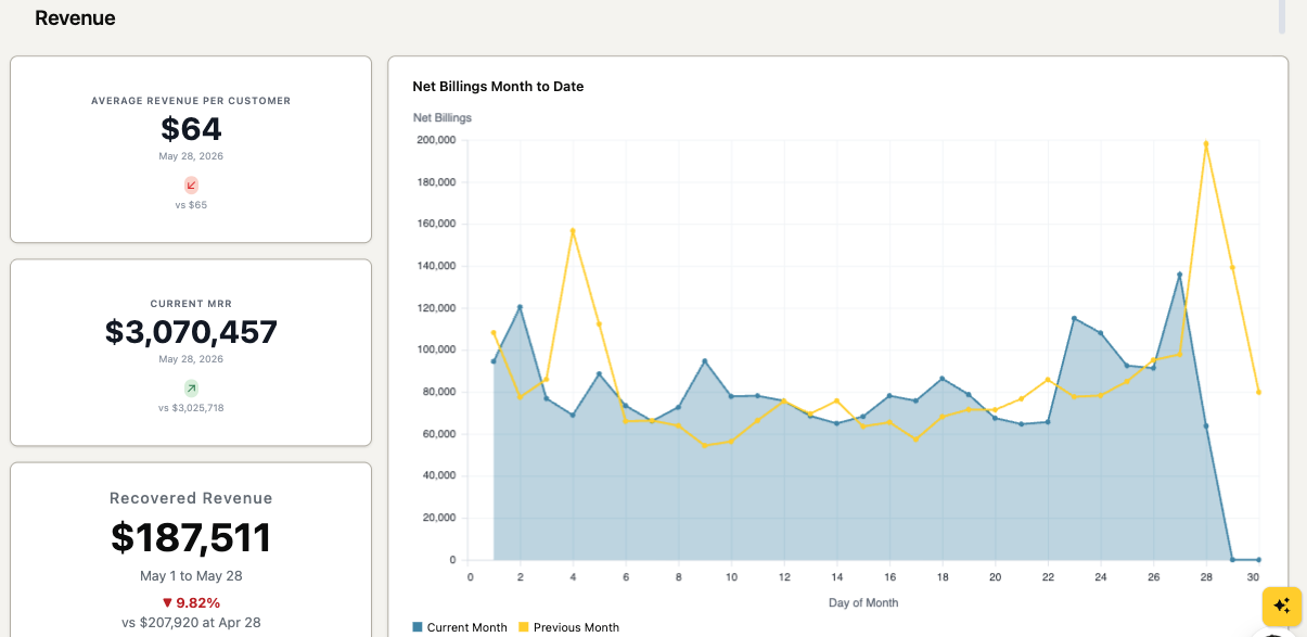
Average revenue per customer
The average revenue per customer — calculated by dividing the total billings (recurring and non-recurring) in the previous month by the number of unique paying customers.
Current Monthly Recurring Revenue (MRR)
Expected monthly revenue calculated by summing charges from active subscriptions and adjusting for the month. Displayed in your site's primary currency.
Recovered revenue
Revenue recovered by Recurly that would otherwise have been lost to failed credit card transactions.
Net billings month to date
A comparison of net billings for the current month against the previous month. Click any point on a line to see billing details for that timeframe. Toggle legend colors to show or hide the current and previous month lines.
Updated 12 days ago