
HomeProduct DocsAPI ReferenceChangelog
RecurlyAPI GuidesRecurly.jsWebhooksAPI ReferenceSupportBook demo
Product Docs

Plan KPI

Dive into 'KPIs' for a bird's-eye view of your plan's performance. Decode key metrics & attributes to steer your strategy effectively.

The Plan KPIs dashboard gives you a complete picture of how each of your plans is performing. Review plan attributes and key metrics side by side, track subscription growth and churn by plan, and see how subscribers move between plans over time.
Available on all Recurly plans

Prerequisites

  • Users must have Analytics user role permission.

Definition

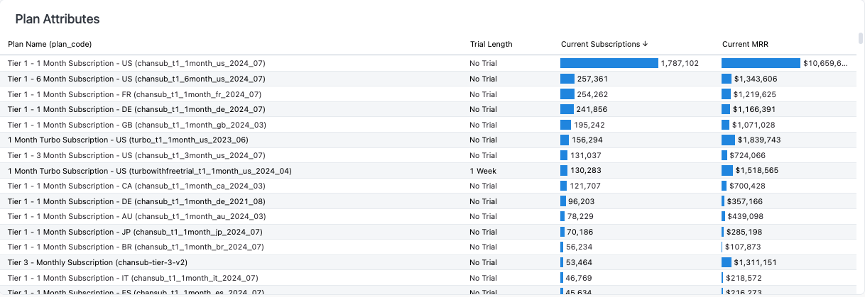
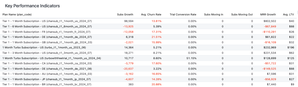
The KPIs view is split into two sections: Plan Attributes & KPIs and Key Performance Indicators. The Attributes section covers the fundamental details of each plan, while the KPIs section provides the metrics behind their health and performance. Together, they give you a complete picture to inform your decisions.
NoteIt's important to understand the difference between a subscriber and a subscription. A single subscriber might hold multiple active subscriptions, but this dashboard counts each individual subscriber — not the number of subscriptions they hold. Data only includes plans that have had at least one subscriber.
TipFor more on navigating and using the filter tools, see our analytics overview documentation.

Key benefits

Quick plan reference The Attributes section gives you the essential specs for each plan in one place, so you can cross-reference plans quickly.
Complete performance view Metrics like churn rate, MRR growth, and average LTV give you a full picture of plan health, so you can spot what's working and what needs attention.
Efficient navigation Plan name and plan code links on the KPI page take you straight from analysis to the matching configuration screen in the Recurly app.

KPIs

This view has two subsections: Plan Attributes & KPIs and Key Performance Indicators (KPIs).

Attributes

The Attributes section displays plan details such as the plan name, plan code, trial length, current subscriptions, and current MRR. Use these details to cross-reference plan information and navigate more easily when analyzing multiple plans.
Key performance indicators (KPIs)

The KPIs section gives you a snapshot of plan performance, including subscription growth, average churn rate, trial conversion rate, subscriptions moving in, subscriptions moving out, MRR growth, and average lifetime value (LTV). Use it to identify which plans are performing well and which need improvement.
Using the KPIs dashboard

1

Review the KPIs section

Go to the Plan KPIs dashboard and check the KPIs section for an at-a-glance view of how your plans are performing.

2

Check the Plan Attributes & KPIs section

Review this section for the specifics of each plan.

3

Revisit KPIs regularly

Set a regular schedule to check back on these metrics so you can monitor and benchmark their progress over time.

NoteOn the KPI page, both the plan name and plan code are links. Selecting either one takes you to that plan's configuration page in the Recurly app.

Plan performance

Subscriptions

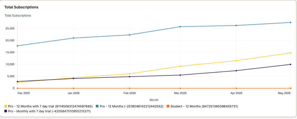
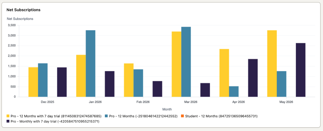
The Subscriptions view includes a line chart showing subscription totals and three bar charts showing subscription growth.

The line chart shows your overall growth trend and which plans have the highest subscription counts.
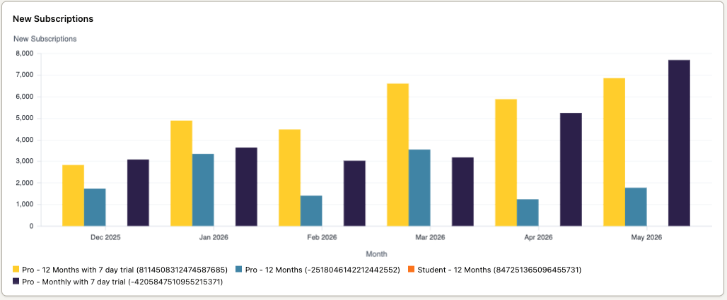
The three bar charts — net, new, and churned subscriptions — let you analyze subscription growth rate, see which plans are gaining or losing subscribers, and spot which plans have higher churn rates.

Net subscriptions
New subscriptions
Churned subscriptions
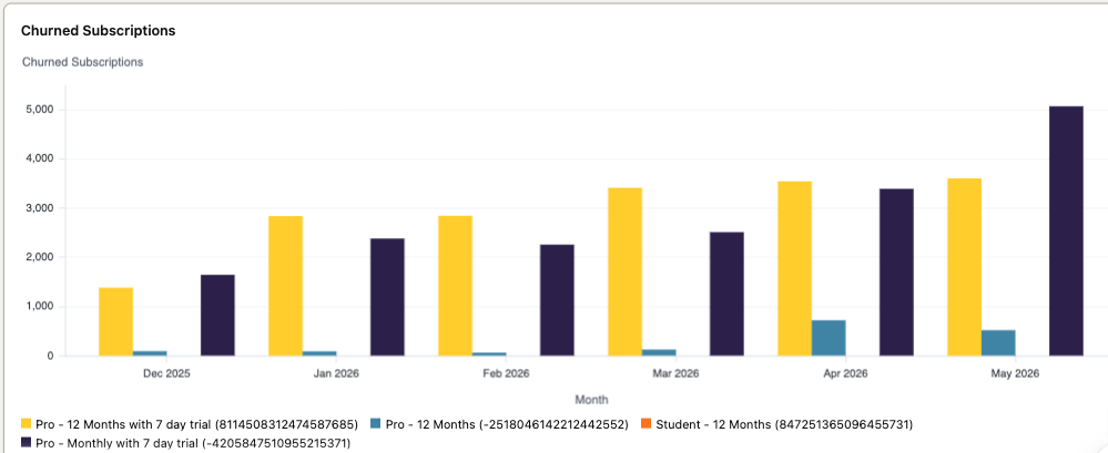
Each chart shows the top 5 or top 10 subscription plans, ranked by total subscriber count, so you can quickly see which plans have higher churn rates and understand subscriber trends and behavior.

How to use plan performance subscriptions

1

Go to the Subscriptions view

Open the Subscriptions view within the Plan KPIs dashboard.

2

Review the line chart

Check the line chart showing subscription totals for a visual read on your overall growth trend.

3

Check the bar charts

Review the net, new, and churn subscription bar charts to gauge growth rate and see which plans are gaining or losing subscribers.

4

Identify high-churn plans

Flag plans with higher churn rates and brainstorm strategies for improvement.

Plan movement

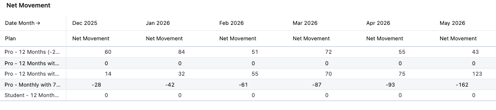
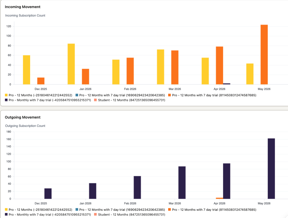
The Plan Movement view has one trend chart in the Plan Movement section and two bar charts in the Plan Movement Breakout section.

The trend chart shows net movement for your top five plans, helping you see which plans are gaining or losing subscribers.
The bar charts in the Plan Movement Breakout section show incoming and outgoing subscriptions, so you can see how customers are moving between plans.
How to use plan movement

1

Go to the Plan Movement view

Open the Plan KPIs dashboard and navigate to the Plan Movement view.

2

Review the trend chart

Check the trend chart in the Plan Movement section for net movement across your top plans.

3

Check the breakout charts

Review the two bar charts in the Plan Movement Breakout section to see how customers are moving between plans.

4

Apply what you find

Use this data to improve your plan design and customer retention strategies.


Did this page help you?