
Renewal invoices trendalyzer
Learn how to use Recurly's renewal invoices trendalyzer dashboard to pivot and trend renewal invoice data by payment type, brand, gateway, and outcome.
Prerequisites
- Users must have Analytics user role permission.
Definition
Key benefits
Key details
This breakout dashboard lets you adjust the pivot table to view fields in different orders and switch between metrics like Total Paid Count, Total Count, Total Paid Amount, Renewal Rate by Count (%), and Renewal Rate by Amount (%). The top chart shows your primary dimension over time, while the table breaks that dimension down by your selected breakout dimensions.
General filters (top left corner)
- Timeframe: Analyze data across different monthly timeframes.
- Invoice creation date: Select a specific date range, up to the last 18 months, using the start and end date dropdowns.
- Primary dimension: Focus on a specific metric by selecting from Payment Type, Brand, Gateway, or Invoice Outcome.
- Dimension breakout 1: Choose an additional dimension from the list, or view all dimensions.
- Dimension breakout 2: Choose another dimension from the list, or view all dimensions.
- Metric: Select the key metric to analyze — Total Paid Count, Total Count, Total Paid Amount, Renewal Rate by Count (%), or Renewal Rate by Amount (%).
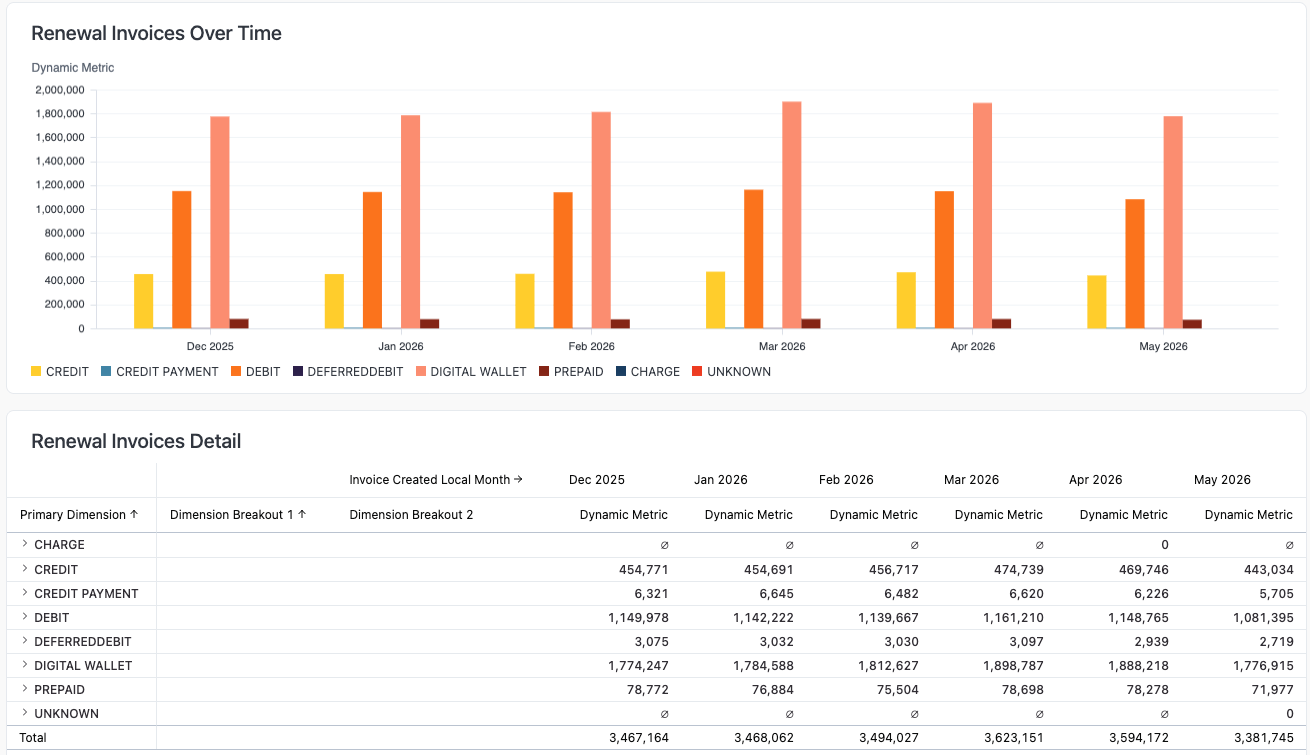
Renewal invoices over time
The Renewal Invoices Over Time bar chart shows how different payment methods trend across consecutive months, making it easy to spot seasonal patterns, shifts in payment preference, or anomalies in transaction volume.
The Renewal Invoices Detail table below it complements the chart with an exact breakdown of the selected metric for each payment type, month by month, so you can make precise comparisons over time. Together, these two views help you see which payment methods drive most of your renewal activity, track how your payment mix changes, and flag categories — like unclassified or low-volume types — that might need attention.
Updated 2 months ago