
Plans (legacy)
Learn how to use Recurly's Subscriptions by Plan dashboard to track active subscriptions and trends across your plans.
Prerequisites
- Users must have Analytics user role permission.
Definition
Key benefits
Key details
Subscriptions key performance indicator (KPI)

This widget gives you a quick view of your active subscription counts by plan across different time periods. Compare current totals to last month, the previous few months, or a year ago, with indicators showing whether each plan is trending up or down. Filter by total subscriptions, new subscriptions, or churned subscriptions to focus on what matters most.
Subscriptions by plan
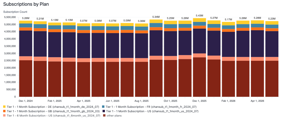
This chart breaks your subscriptions down by plan over your selected timeframe. Each bar represents a time unit, its height shows the total number of subscriptions, and each plan gets its own color for easy comparison. Select a bar or section to see detailed subscription totals for that plan.
Subscriptions by plan details table
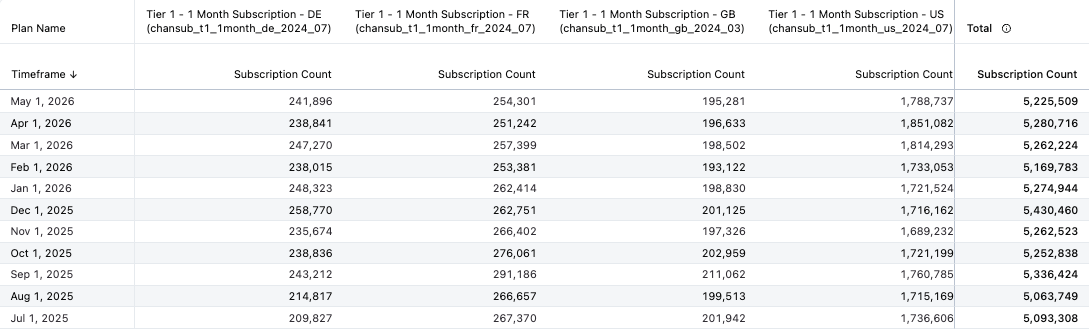
This table gives you a detailed view of active subscriptions for your selected plans against the overall total, organized by timeframe. Use it to analyze the long-term performance of your plans and spot which are consistently successful and which need adjustment.
Using the dashboard
A few ways to get more out of this dashboard:
- Filter your view: Use filters like Select Timeframe, Select Plans, and Plans to tailor the data to your needs.
- Refresh your data: Refresh the dashboard whenever you need the most current figures.
- Download and share your data: Download the data in your preferred format to share with your team for further discussion.
Updated 2 months ago