Explore overview
Recurly Explore lets Elite plan users build custom data reports, analyze subscription and transaction data with natural language via the Workbook Agent, and create shareable dashboards.
Definition
Key benefits
Key details
Explore interface
The Explore interface is divided into three panels:
| Panel | Description |
| Left — Workbook | Ask natural-language questions about your data. The Workbook Agent suggests fields and runs queries on your behalf. |
| Center — Field picker | Browse and search the full field catalog, grouped by topic. Click any field to add it to your query. Use the In-use filter to see only selected fields. |
| Right — Results area | Toggle between Results (table view), Chart (visualization), or both. Use the Options tab to configure axes, grouping, and chart type. Click Preview to run a sample query before committing. |
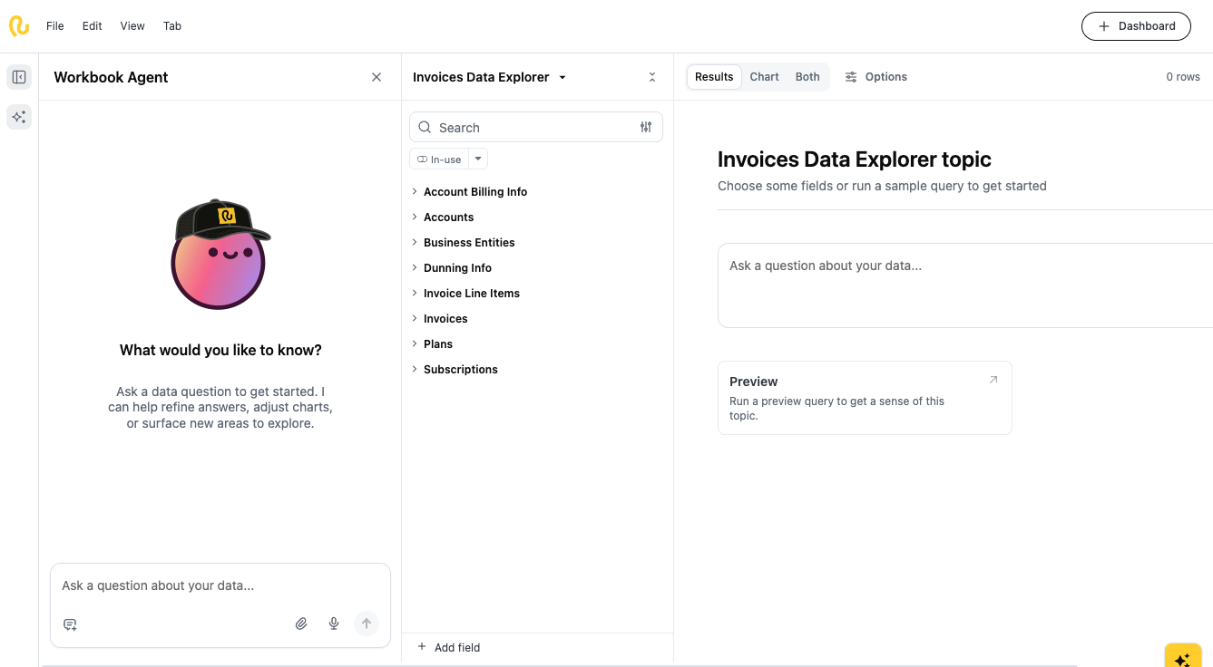
Workbook Agent
The Workbook Agent is the fastest way to start an analysis. Type a question in the text box at the bottom of the left panel and press Enter (or click the send icon).
Example prompts:
- "Show me all failed transactions in the last 7 days grouped by failure reason"
- "What is the total transaction volume by country this month?"
- "Which credit card types have the highest decline rates?"
- "List transactions flagged for fraud in the past 30 days"
- "Break down successful transactions by plan and subscription state"
After the agent populates a query, you can add or remove fields manually using the center field picker. Changes reflect immediately in the results view.
Work with reports
Open an existing report

Run or refresh a report
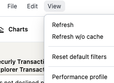
Refresh — Re-runs the report against previously saved results. If the same query (same fields, filters, and sorts) was run within the last hour, Explore loads those cached results instantly. A new query is only sent if the cache has expired or the report configuration has changed.
Refresh without cache — Bypasses stored results and sends a direct query to your data source for live, up-to-the-minute data.
Create a new report
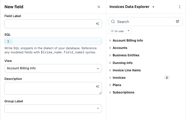
Create a custom field
Custom fields let you create formulaic calculations based on existing fields for more personalized reporting.
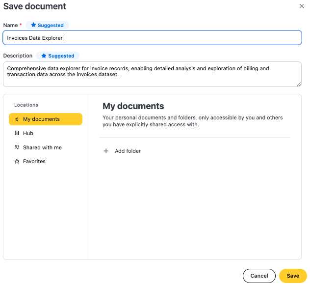
Save a report
Work with dashboards
To create a dashboard, click the + Dashboard button in the top right corner of the document.
Once in a dashboard, you can add, modify, resize, and remove elements — including visualizations, headers, filters, and text blocks. Changes are saved automatically as you work. When your dashboard is ready, download it to share a compiled view with your team.
Updated 4 days ago