
Plans (legacy)
Harness the power of your subscription data, refine your offerings, and drive growth with the Plans Section.
Overview
Required plan
This feature or setting is available to all customers on any Recurly subscription plan.
Definition
The Subscriptions by Plans dashboard, a crucial feature of Recurly, displays a complete breakdown of your active subscriptions based on different plans. It's your go-to tool for assessing the popularity of your plans, helping you identify which are driving growth and which need tweaking. Its rich data visualization includes subscriptions in different states, offering a panoramic view of your subscription model's health.
Key benefits
- Intuitive data visualization: The dashboard simplifies complex subscription data into easy-to-understand formats like graphs, bar charts, and tables.
- Customizable timeframe: You have the flexibility to view subscription trends over your chosen period, be it daily, weekly, or monthly.
- Detailed breakdown: Each subscription plan is thoroughly examined, with specific counts for active, trial, canceled, and paused subscriptions.
Key details
Subscriptions key performance indicator
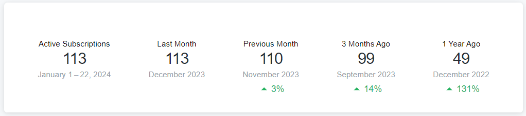
The Subscriptions Key Performance Indicator (KPI) widget offers a quick overview of your active subscription counts across different time periods. It compares current active subscription numbers by plan to previous periods, such as last month, three months, or a year ago, with indicators showing whether there's an increase or decrease. This widget is crucial for tracking subscription trends and making informed decisions based on these patterns. You can filter down to look at plans by total subscriptions, new subscriptions, and churned subscriptions.
Subscription by plans graph
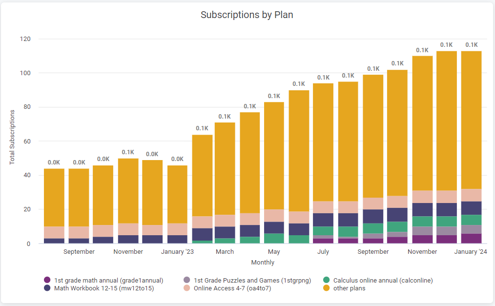
This feature visually breaks down your subscriptions by plan over your selected timeframe. Each bar in the chart represents a time unit, and its height indicates the total number of subscriptions. The bars are color-coded for different plans, allowing for immediate visual comparison. Clicking on a bar or section provides detailed subscription totals for each plan.
Subscriptions by plans details table
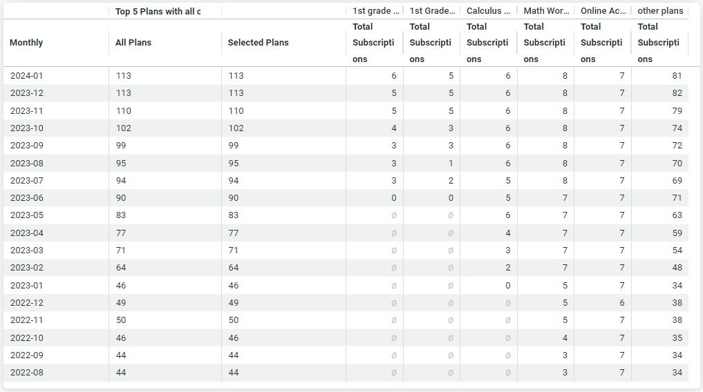
The detail table provides a thorough view of your active subscriptions for chosen plans compared to the overall total. Organized by your selected timeframe, this table is essential for analyzing the long-term performance and popularity of your plans. It helps in identifying which plans are consistently successful and which may require adjustments.
How to utilize the subscription by plans dashboard
Understand your key performance indicators (KPIs): The dashboard's KPI view shows current active subscription totals by plan over different time periods. Use the indicators to compare changes in active subscriptions across various periods.
Read the bar chart: This chart shows subscription numbers for selected plans over your chosen timeframe. Each bar is time-specific and color-coded to represent different plans. Click on a bar to see detailed numbers for each plan.
Analyze the details chart: This chart compares the total number of active subscriptions for selected plans against the total for all plans, within your preferred timeframe. It's useful for pinpointing high-performing plans and those needing improvement.
Filter your view: Personalize the dashboard with filters like 'Select Timeframe', 'Select Plans', and 'Plans' to tailor the displayed data to your needs.
Refresh your data: Stay updated with the latest information by refreshing the data on the dashboard, ensuring you're always working with the most current figures.
Download and share your data: Enhance team collaboration by downloading and sharing the data in your preferred format for further discussion or analysis.
Updated 3 months ago